Choosing the right stucco and trim color combinations is a harder decision to make than most homeowners realize. A color that seems perfect on a small paint sample at the hardware store might wash out in the sun once it’s on your wall. In Las Cruces, NM, the blinding desert sun, unique local architecture, and natural surroundings all influence how colors appear from the street.
In this blog post, you’ll learn how to choose stucco and trim color combinations that hold up in the Las Cruces climate, match your neighborhood’s aesthetic, and take inspiration from the desert landscape.
If you still need help making a decision after reading through this guide, contact Engel Coatings Inc. to schedule a color consultation with the best exterior stucco contractors in Las Cruces, NM.
Color theory helps you predict how colors will look together before you commit. Start by looking at a color wheel. Notice how each color has a position and an undertone that changes how it interacts with others. Spend a few minutes finding warm and cool colors, complementary pairs, and groups of colors that sit next to each other. This simple exercise makes it easier to see which combinations feel energetic and which feel calm.
Warm colors, such as sand, tan, and terracotta, sit on one side of the wheel. They create a softer look and make large areas feel more inviting. Cool colors, such as blue-gray or slate, sit on the opposite side and make lines and edges stand out more clearly. If you want to combine warm and cool, choose one as the main field color and use the other in smaller accents.
Complementary colors are directly across from each other on the wheel. They create a strong visual contrast that works well for trim, beams, and entry features. Analogous colors are next to each other on the wheel, resulting in a smoother, more unified look that works well for larger surfaces.
Value is the lightness or darkness of a color. When planning your palette, adjust values in small increments to ensure the design feels balanced. Use dramatic contrasts on smaller details while opting for subtler color shifts on larger walls to avoid overpowering the space.
In Las Cruces, choosing the right color is just as much about durability as it is about appearance. Consider the following factors before choosing stucco and trim color combinations for the exterior of your home:
The high desert sun in Las Cruces is bright enough at midday to flatten shadows and make light colors look washed out.
Pastels and other neutral tones often lose depth under this intensity, which can make a freshly painted wall appear faded. Early morning light creates a cooler cast that reduces the warmth of reds, oranges, and yellows. Late afternoon light shifts toward orange, which can make terracotta, rust, and deep brown appear richer and darker.
Testing color samples outside in each of these lighting conditions ensures that the final result looks intentional, no matter the time of day.
Prolonged UV exposure in Las Cruces accelerates pigment breakdown, especially on walls facing south and west, where the sun is most direct.
Cheap pigments fade unevenly, leaving patchy spots that stand out against the rest of the wall. Darker stucco shades that absorb heat expand and contract more often, which increases the likelihood of hairline cracks.
Choosing high-grade coatings with UV-resistant pigments keeps colors from fading unevenly in the Las Cruces sun. Durable resin in the coating also helps the stucco resist cracking from heat expansion. These qualities protect the surface and help you avoid frequent repainting.
Pueblo and Territorial-style neighborhoods in Las Cruces often feature muted earth tones inspired by desert soil and stone.
Using a color temperature similar to nearby homes keeps the streetscape visually cohesive. Small adjustments in shade or value can make a home distinct without disrupting the surrounding palette. Coordinating the garage doors and trim with the main body color gives the facade a unified look. Adding a single accent on an entryway or architectural detail creates a focal point that draws the eye.
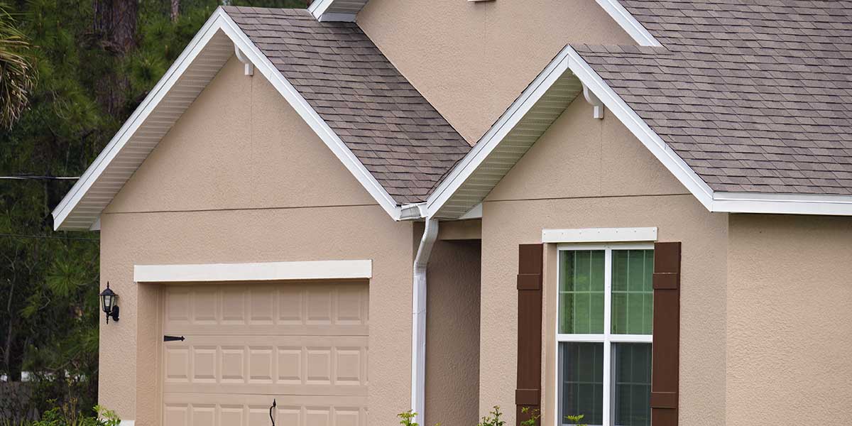
Choosing colors that match your home’s architectural style makes the details look deliberate instead of random. Start with the palette common to the style’s era, then adjust value and saturation so the colors work with modern stucco finishes, roofing, and trim materials.
Homes in these styles rely on earthy stucco fields paired with dark wood or bronze trim, which helps the heavy walls feel grounded and emphasizes deep shadows. Terracotta roof tiles pair well with warm wall colors and soft cream accents on lintels or window surrounds. Icy whites tend to look harsh in the desert sun and can clash with the rounded forms of adobe-inspired construction.
This style often features squared cornices and brick coping, which look best with creamy field colors and deeper trim for definition. Medium-tone window bands give muted pastels enough definition to keep them from washing out. Entry doors should be simple and strongly saturated so they stand out without clashing with other details.
Use light wall colors with dark trim to make your home’s edges stand out. Using one hue in different values allows shadow lines to create depth without adding ornament. Limit accent colors to the front door and hardware so the architecture stays clean and uncluttered.
In Las Cruces, NM, stucco color influences how much solar heat your walls absorb. Darker walls take in more sunlight, raise surface temperatures, and create an extra-hot indoor environment. Higher indoor temperatures make your AC run longer to keep rooms comfortable. Lighter walls reflect sunlight, keep surface temperatures lower, and let the system cool with fewer, shorter cycles.
White and off-white paint reflects about 80% of sunlight. Cooler wall temperatures reduce heat transfer into living spaces, so your AC doesn’t need to run as often. Pale beige and soft gray reflect about 60-70% of sunlight, which helps walls remain cooler even on south and west sides.
Warm tans, muted greens, and soft blues reflect about half the sunlight they receive. Walls warm up more than they would with lighter colors, but good insulation and air sealing keep most of that heat outside. Shade from eaves, awnings, or pergolas helps even more during late afternoon sun.
Dark browns, charcoals, and reds absorb over 70% of sunlight. The heat they store moves indoors after sunset, which keeps your AC running longer and raises cooling costs during the hotter months.
Limit your darker stucco and trim color combinations to smaller features like trim, beams, and the front door. Cool-wall or heat-reflective coatings reduce the amount of heat the surface absorbs without altering its visible color. Test sample panels on sun-facing walls and use an inexpensive infrared thermometer to see exactly how each color performs.
Combining thoughtful color placement, reflective coatings, and shade from eaves or landscaping creates the look you want without driving up your energy bill.
Color choices don’t stop at the walls and roof. Your landscaping and hardscaping set the backdrop that frames the entire home. If you choose colors that work with these permanent elements, your house will look integrated instead of disconnected from its surroundings.
Look at your driveway, walkways, patios, and retaining walls. Concrete, pavers, and stone all have their own undertones. A cool-toned slate walkway will pair better with gray-based stucco than with a warm beige. Red brick paving benefits from warmer field colors and trim that echoes the brick’s depth.
Landscaping adds another layer. Large green plantings tend to cool the overall view, so slightly warmer wall colors keep the home from feeling flat. Desert-adapted plants and gravel beds usually push the palette toward neutral tans and browns, which makes cool trim an easy way to add definition.
Water features, metal fencing, and outdoor furniture also influence the balance. Matching your trim or accent color to one of these elements creates repetition that makes the design feel deliberate. The fewer “orphan” colors you introduce, the stronger the visual connection between house and yard.
Taking the time to coordinate these exterior elements early ensures your stucco and trim choices work with the full property, not just the structure.
Paint looks different on a swatch card than it does on your walls in the Las Cruces sun. Put your choices on your house before committing to the full job. Test them where you can see the light, surrounding homes, and your roof together, so you know exactly how the finished project will look.
Start by matching your wall and trim colors to your roof’s undertone so they work together above eye level. Keep any stone or brick in mind if you’re not replacing it soon. Use the same metal finish on your fixtures, railings, and hardware so they feel deliberate.
Paint large swatches on two walls with different sun exposure so you can see real shifts in color. Step back to the street and check them from your front entry and driveway. Take photos in the morning, at midday, and at sunset so you can compare the changes.
Limit yourself to one main field color, one trim, and one accent. Review a sample door or shutter to confirm your edges and sheen. Finalize your stucco and trim color combinations only after this full review, so you don’t end up needing to make costly changes.
Any color can work if it fits the architecture, lighting, and surroundings. When a home’s colors look mismatched or unappealing, it’s usually because the homeowner picked them without considering how they work together on the house. Avoid these mistakes to keep your exterior looking cohesive.
Color chips in a store sit under artificial light and are too small to show how the shade will read outdoors. Small brush-outs also hide undertones that only become obvious when the color covers a full wall. Painting large swatches in natural light on different walls helps you see the real effect and prevents costly repainting or patching later.
Very dark trim on thin edges can turn windows into harsh cutouts. High contrast on too many edges makes a facade look busy and breaks up the design. Keep bolder accents at the entry or another focal point, and use softer, gradual changes for the rest of the trim.
Trendy palettes often overlook fixed elements, such as the roof, light conditions, and the colors of nearby homes. What looks great in a magazine might clash in your street or fade quickly in strong sun. Timeless schemes that fit the environment hold their appeal longer and protect your investment.
Great stucco and trim color combinations come from understanding how light, materials, and architecture work together. Testing colors in the Las Cruces sun shows how they look year-round, so your choice works in every season. Disciplined palettes protect both the look and longevity of the finish, keeping walls sharp for years.
If you want to protect your investment, read our other blog post on preventing stucco damage to learn how to keep your exterior looking new. Call Engel Coatings Inc. at 575-642-5481 for help choosing an exterior design color palette backed by over 30 years of local experience.